

martBiz: The Intelligent Assistant for Modern Business
A predictive analytics dashboard that turns complex operational data into clear, actionable strategy for agile teams.
Role: Lead UI/UX Designer
Industry: SaaS / Business Intelligence (AI)
Tools: Figma, Adobe Illustrator
Platform: Web Application & Marketing Site
The Product
SmartBiz is an all-in-one business intelligence platform powered by AI. Unlike traditional dashboards that just show what happened, SmartBiz focuses on what will happen. It integrates sales data, scheduling, and team performance metrics to provide predictive insights and real-time strategic recommendations.
Users
Business Leaders & Founders: Decision-makers who need a high-level view of revenue health and operational efficiency without digging into spreadsheets.
Project Managers: Team leads (like “Romaine” and “Divya” from our user testimonials) who need to optimize workflows and prevent burnout before it happens.
The Business Goal
To democratize data science. The goal was to build a tool where a user doesn’t need to be a data analyst to understand churn risk or sales forecasting. The interface needed to explain complex data in plain English.
The Business Goal
To democratize data science. The goal was to build a tool where a user doesn’t need to be a data analyst to understand churn risk or sales forecasting. The interface needed to explain complex data in plain English.
The Challenge
How might we visualize “The Future”?
Most business dashboards look like airplane cockpits—overwhelming and cluttered with gauges.
Data Paralysis: Users suffer from “analysis paralysis” when presented with too many raw numbers.
Lack of Context: Knowing that “Revenue is $67k” is useless without knowing if that’s good or bad, or what to do next.
Trust Gap: Users are skeptical of AI. The design needed to prove its accuracy and logic to build trust.
The Solution
My design strategy was “Insights over Raw Data.” I prioritized text-based explanations and confidence scores over complicated charts.
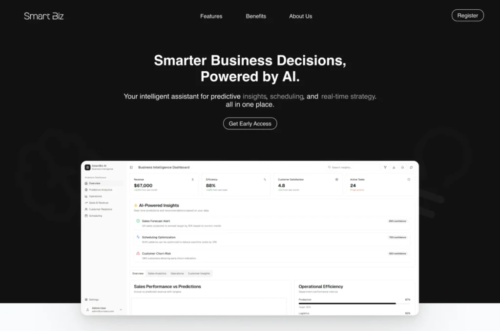
1. The “Answer-First” Dashboard
I designed the main dashboard to function like a news feed for the business.
AI-Powered Insights: Instead of burying the lead, the center of the screen features a dynamic list of alerts (e.g., “Sales Forecast Alert”). Each insight is paired with a clear Confidence Score (e.g., “89% confidence”), giving users the context they need to trust the prediction.
KPI Cards: The top row remains reserved for the “North Star” metrics (Revenue, Efficiency, CSAT), utilizing sparklines to show trends at a glance.
2. Human-Centric Operations
A unique aspect of SmartBiz is its focus on team well-being, not just profit.
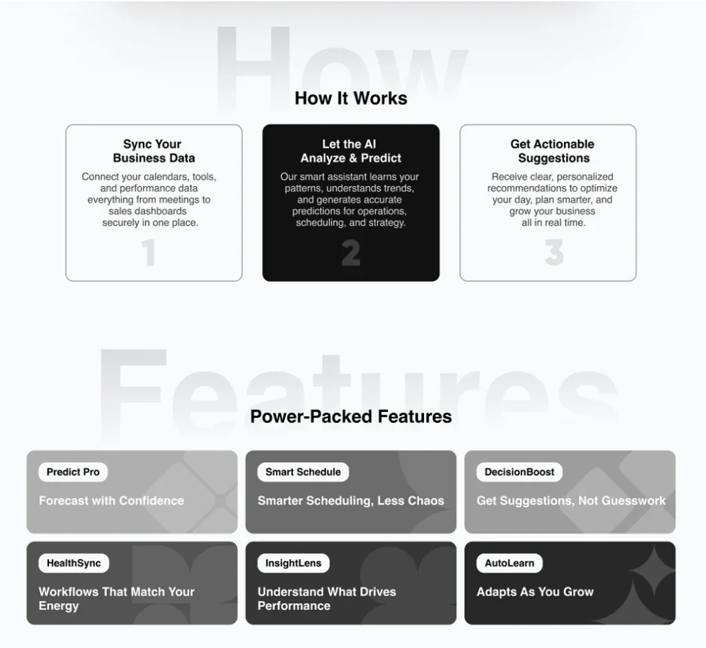
HealthSync & StressLess Ops: I designed features that visualize team energy levels. The “Smart Schedule” doesn’t just fill time slots; it optimizes them based on “Workflows That Match Your Energy,” reducing burnout.
Operational Efficiency Gauge: A linear progress bar clearly visualizes how close the team is to max capacity, acting as an early warning system for management.
3. The “Dark Mode” Brand Experience
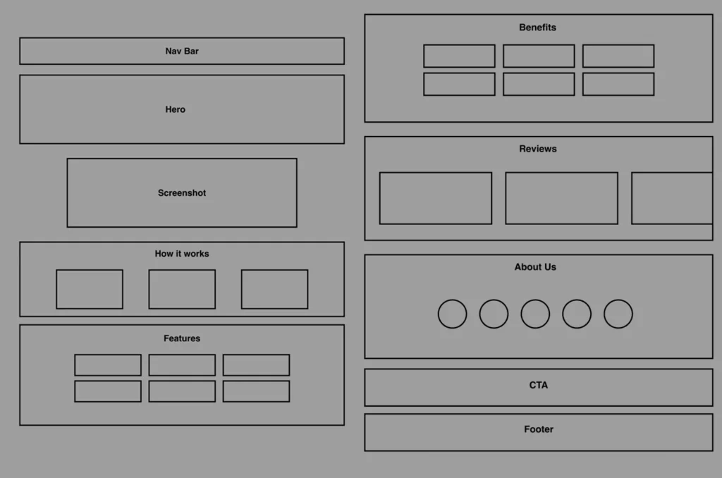
For the marketing site, I utilized a sleek, dark aesthetic to convey sophistication and modern tech.
Visual Hierarchy: The landing page uses high-contrast typography (“Smarter Business Decisions”) to grab attention, while the dashboard itself switches to a clean Light Mode to ensure maximum readability for heavy data usage.
Transparency: The “How It Works” section simplifies the AI “black box” into three digestible steps: Sync -> Analyze -> Act, making the onboarding process feel less intimidating.
4. Social Proof Integration
To combat skepticism about AI tools, I prominently featured human stories.
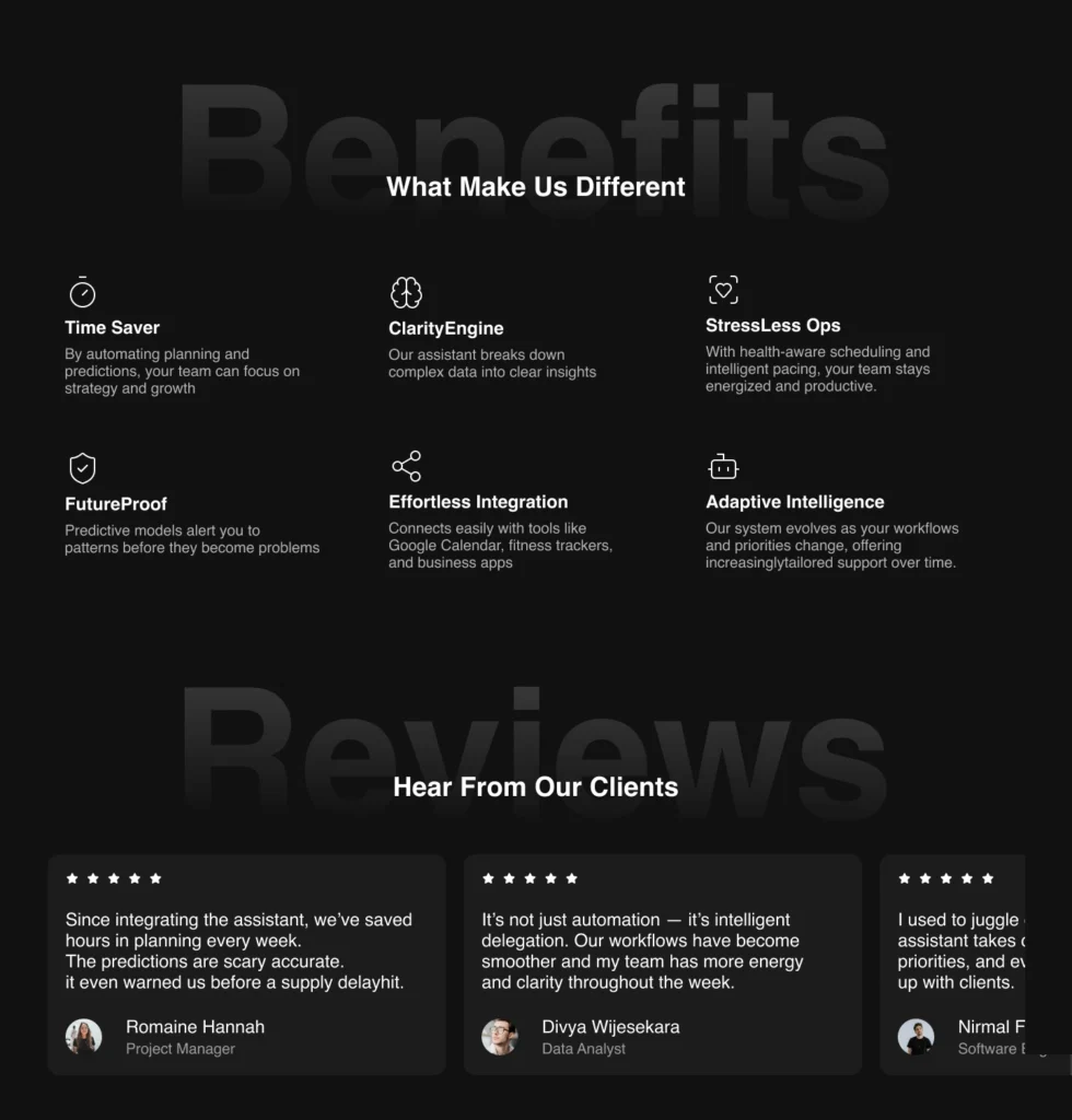
Testimonial Cards: The “Hear From Our Clients” section uses dark cards with stark white text to highlight specific wins, such as “saved hours in planning,” grounding the abstract AI concepts in real-world results.
The Solution
My design strategy was “Insights over Raw Data.” I prioritized text-based explanations and confidence scores over complicated charts.
1. The “Answer-First” Dashboard
I designed the main dashboard to function like a news feed for the business.
AI-Powered Insights: Instead of burying the lead, the center of the screen features a dynamic list of alerts (e.g., “Sales Forecast Alert”). Each insight is paired with a clear Confidence Score (e.g., “89% confidence”), giving users the context they need to trust the prediction.
KPI Cards: The top row remains reserved for the “North Star” metrics (Revenue, Efficiency, CSAT), utilizing sparklines to show trends at a glance.
2. Human-Centric Operations
A unique aspect of SmartBiz is its focus on team well-being, not just profit.
HealthSync & StressLess Ops: I designed features that visualize team energy levels. The “Smart Schedule” doesn’t just fill time slots; it optimizes them based on “Workflows That Match Your Energy,” reducing burnout.
Operational Efficiency Gauge: A linear progress bar clearly visualizes how close the team is to max capacity, acting as an early warning system for management.
3. The “Dark Mode” Brand Experience
For the marketing site, I utilized a sleek, dark aesthetic to convey sophistication and modern tech.
Visual Hierarchy: The landing page uses high-contrast typography (“Smarter Business Decisions”) to grab attention, while the dashboard itself switches to a clean Light Mode to ensure maximum readability for heavy data usage.
Transparency: The “How It Works” section simplifies the AI “black box” into three digestible steps: Sync -> Analyze -> Act, making the onboarding process feel less intimidating.
4. Social Proof Integration
To combat skepticism about AI tools, I prominently featured human stories.
Testimonial Cards: The “Hear From Our Clients” section uses dark cards with stark white text to highlight specific wins, such as “saved hours in planning,” grounding the abstract AI concepts in real-world results.
Design System & Usability
Visual Language
Color Palette:
Marketing: Deep Black/Charcoal background with white text for a premium, futuristic feel.
Dashboard: Clean White background with “Traffic Light” functional colors (Green for growth/safety, Red for churn risk) to guide user attention instantly.
Typography: I used a bold, geometric sans-serif for headings to project confidence and stability.
Where do we go from here?
Next Steps
Natural Language Querying: Allowing users to type “Why did sales drop yesterday?” and getting an AI-generated chart as a response.
Mobile Command Center: A simplified mobile app for receiving push notifications about critical predictive alerts.
What I Learned
Designing SmartBiz taught me that AI needs a human face. By visualizing “Confidence Scores” and focusing on “Team Health,” we turned a cold analytics tool into an empathetic team assistant.