TravelWits, Redesigning the Hotel Booking Experience
TravelWits, Redesigning the Hotel Booking Experience
Overview
Transforming a visually cluttered booking platform into a modern, conversion-focused experience
Role: UI/UX & Product Designer
Duration: 6 Weeks (Replace with actual)
Platform: Web & Mobile
Industry: Travel Technology (B2B/B2C)
Tools: Figma
Responsibilities
UX Audit
Information Architecture
Product Strategy
User Flow
Wireframing
UI Design
Responsive Design
Design System
Overview
Transforming a visually cluttered booking platform into a modern, conversion-focused experience
Role: UI/UX & Product Designer
Duration: 6 Weeks (Replace with actual)
Platform: Web & Mobile
Industry: Travel Technology (B2B/B2C)
Tools: Figma
Responsibilities
UX Audit
Information Architecture
Product Strategy
User Flow
Wireframing
UI Design
Responsive Design
Design System
Before
Low hierarchy
Dense UI
Hard to scan
Weak CTA structure
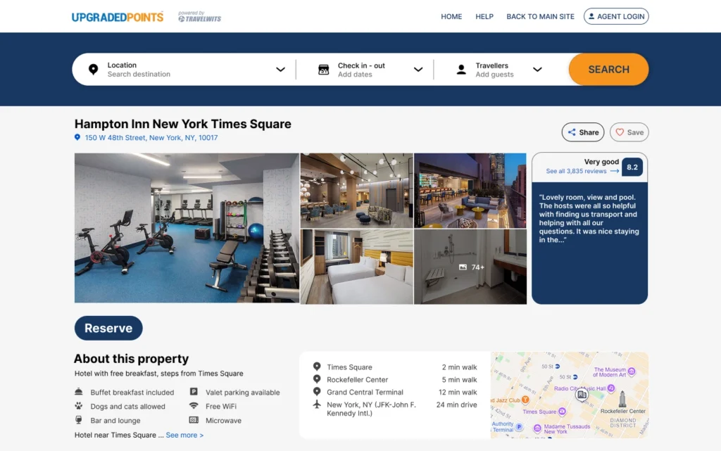
After
Clear booking flow
Strong visual hierarchy
Faster room comparison
Mobile-first design
Before
Low hierarchy
Dense UI
Hard to scan
Weak CTA structure
After
Clear booking flow
Strong visual hierarchy
Faster room comparison
Mobile-first design
The Problem
TravelWits had a powerful booking system but a poor user experience caused by weak visual hierarchy, inconsistent layout structure, and overwhelming information density. Users struggled to compare rooms and make quick booking decisions, especially on mobile devices.
What I Fixed
Improved visual hierarchy for faster scanning
Simplified room comparison flow
Reorganized booking information architecture
Reduced cognitive load on decision pages
Designed mobile-first responsive experience
Strengthened CTA placement for conversions
The Problem
TravelWits had a powerful booking system but a poor user experience caused by weak visual hierarchy, inconsistent layout structure, and overwhelming information density. Users struggled to compare rooms and make quick booking decisions, especially on mobile devices.