
Upgraded Points: Streamlining the Hotel Booking Experience
A responsive travel booking engine designed to reduce “analysis paralysis” through clear visual hierarchy and smart room comparison.
Role: Lead UI/UX Designer
Industry: Travel & Hospitality
Tools: Figma, Adobe Illustrator
Platform: Web Dashboard
The Product
Upgraded Points is a hotel booking platform that simplifies the travel planning process. Unlike cluttered aggregators, it focuses on high-quality visuals and transparent pricing to help travelers secure their ideal stay with confidence.
The Users
Leisure Travelers: Individuals or families planning vacations who need detailed amenity information (pool, breakfast, bed size).
Business Travelers: Users needing quick bookings near specific landmarks (e.g., Times Square) with flexible cancellation policies.
The Business Goal
To increase the “Look-to-Book” ratio. The goal was to minimize the friction between finding a hotel and confirming the reservation by making room differences and pricing crystal clear.
The Challenge
How might we cure “Tab Fatigue”?
Travelers often open dozens of tabs to compare room sizes, views, and cancellation policies.
Information Overload: Most booking sites bury critical details (like “City View” or “Free Wifi”) in dense text blocks.
Mobile Frustration: Complex room comparison tables rarely translate well to small screens, causing users to abandon bookings on mobile devices.
The Solution
My design strategy was “Comparison at a Glance.” I prioritized scannability, ensuring users could differentiate between a standard room and a suite without reading fine print.
1. The Immersive Hero Section
I designed the property landing page to establish immediate context and desire.
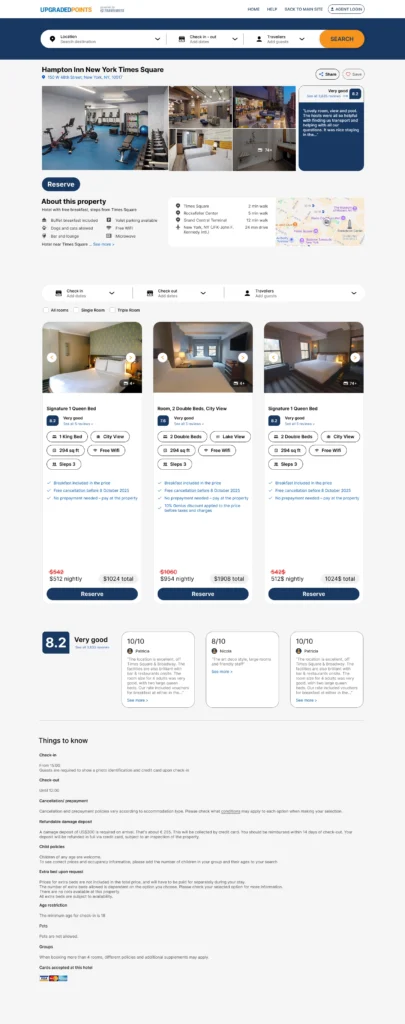
Visual Anchoring: A high-quality image grid showcases the hotel’s best assets (gym, lobby, room interior) immediately, rather than hiding them in a carousel.
Contextual Map: The location is crucial. I integrated a map preview directly next to the “About” section, highlighting proximity to key landmarks like “Rockefeller Center” (5 min walk), saving users from switching to Google Maps.
2. The “Decision Engine” (Room Selection)
This is the core of the conversion funnel. I replaced standard list views with highly structured Room Cards.
Amenity Badges: Instead of bullet points, I used pill-shaped badges for key decision factors: “1 King Bed,” “City View,” and “294 sq ft.” This makes scanning horizontally across different rooms effortless.
Transparent Pricing: The price is bold and isolated at the bottom with the total cost clearly visible, avoiding “checkout shock”.
3. Seamless Mobile Adaptation
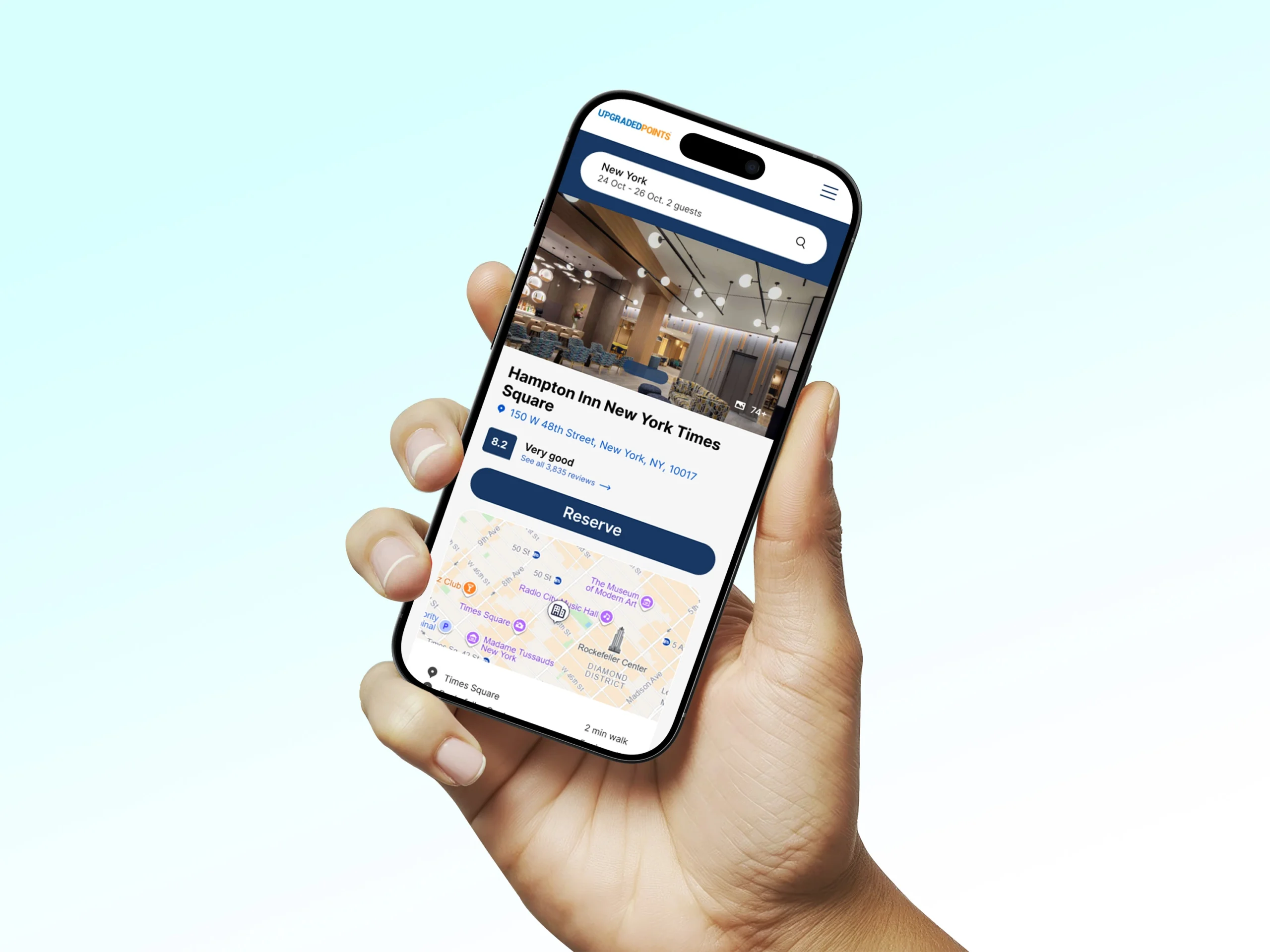
Travelers often book on the go. I ensured the complex desktop data stacked elegantly on mobile.
Thumb-Friendly UI: The “Reserve” button spans the full width of the bottom screen on mobile, making it easily accessible for one-handed use.
Stacked Cards: The horizontal room cards from the desktop version transform into vertical, full-width cards on mobile, retaining all the amenity badges without cramping the screen.
4. Trust Signals
To reassure users, I designed a Review Summary module.
Score Highlight: The “8.2 Very good” badge is prominent, immediately signaling quality.
Curated Feedback: User testimonials are presented in clean cards that highlight specific pros (e.g., “Location is excellent”), helping new users trust the listing.
Design System & Usability
Visual Language
Color Palette: I used a deep Navy Blue for primary actions (Reserve, Search) to convey reliability and premium service, contrasted with a soft gray background to let the colorful hotel photos pop.
Iconography: Simple, outlined icons (bed, eye for view, wifi signal) were used to transcend language barriers and speed up information processing.
Where do we go from here?
Next Steps
Loyalty Integration: Designing a “Points vs. Cash” toggle for users to see how many points they need to redeem for a free night.
Interactive Map Search: Allowing users to search for hotels by drawing a specific area on the map.
What I Learned
Designing Upgraded Points taught me that in e-commerce, structure is sales. By breaking down complex room specs into standardized visual tags, we reduced cognitive load and empowered users to hit “Reserve” faster.
