
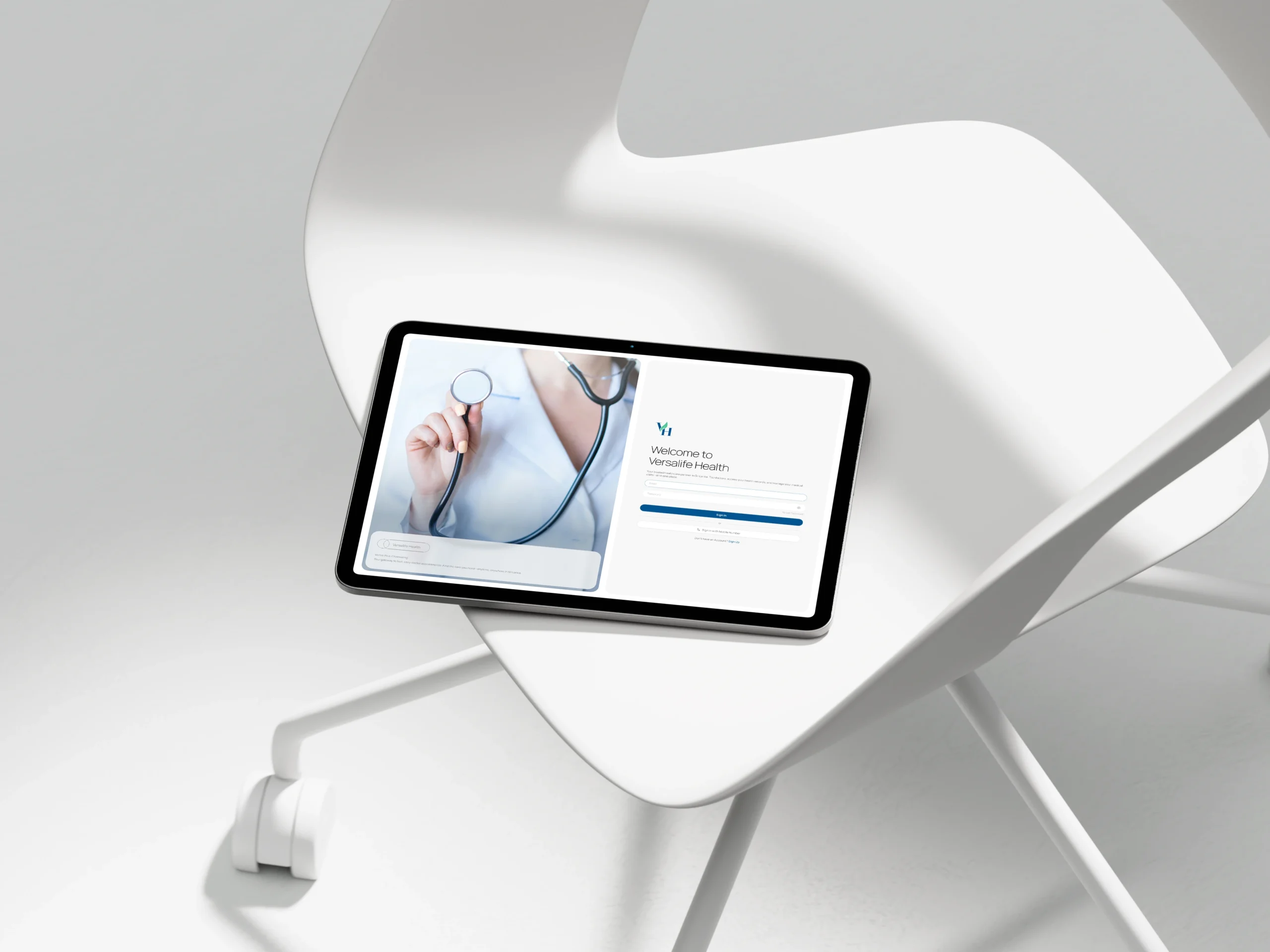
Versalife Health: Bridging the Gap in Sri Lankan Healthcare
A comprehensive e-channeling and telemedicine platform connecting patients with top doctors for seamless digital healthcare.
Role: Lead UI/UX Designer
Industry: Agriculture Tech / BioTech
Tools: Figma, Adobe Illustrator
Platform: Web Dashboard
The Product
Versalife Health is a dual-sided digital health platform designed to simplify the medical appointment process in Sri Lanka. It serves as a centralized hub where patients can book appointments, manage prescriptions, and consult with doctors via video, while doctors can manage their practice and patient records.
Users
Patients: Individuals seeking convenient access to specialists without the hassle of physical queues or complicated hospital phone systems.
Medical Professionals: Doctors requiring a streamlined system to manage their schedule, digitize patient records, and expand their reach through telemedicine.
The Business Goal
To create a trustworthy, “all-in-one” ecosystem that reduces appointment no-shows, simplifies the registration process for new doctors, and makes remote healthcare accessible to anyone with an internet connection.
The Business Goal
To create a trustworthy, “all-in-one” ecosystem that reduces appointment no-shows, simplifies the registration process for new doctors, and makes remote healthcare accessible to anyone with an internet connection.
The Challenge
How might we humanize the digital doctor visit?
Healthcare can be stressful. Users often face anxiety when booking appointments or dealing with complex medical forms.
Friction in Onboarding: Doctors often abandon digital platforms if the registration process is too tedious or asks for too much at once.
Disconnected Experiences: Patients struggle when their booking history, prescriptions, and consultation tools (video) are on different platforms.
The Solution
My design strategy focused on “Calm Efficiency.” I used a clean, minimalist aesthetic to reduce cognitive load, ensuring that whether a user is a tech-savvy youth or an elderly patient, the path to care is clear.
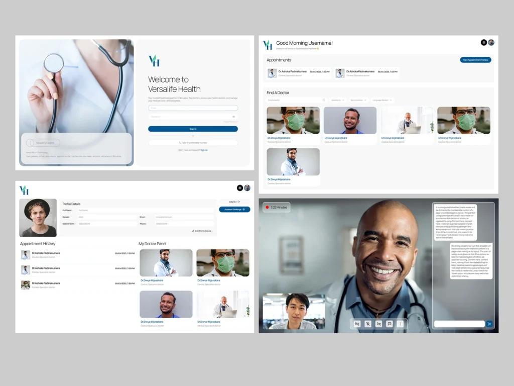
1. The Patient Dashboard: Personal & Proactive
I moved away from sterile medical tables to a card-based, welcoming interface.
Warm Welcome: The dashboard greets the user personally (“Good Morning Username!”) and immediately surfaces the most urgent info: upcoming appointments.
Smart Search: The “Find A Doctor” section uses visual cards with doctor photos and clear specializations (e.g., Cardiac Specialist), making the choice feel more human and less transactional.
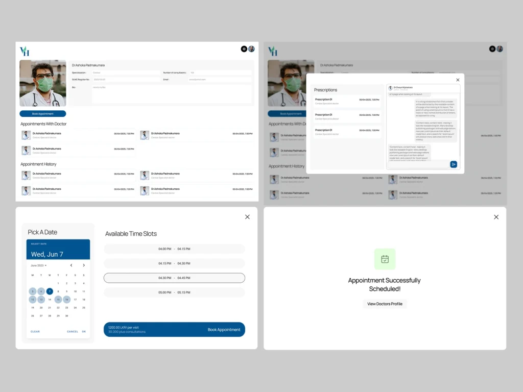
2. Frictionless Appointment Booking
Booking a doctor shouldn’t require a phone call. I designed a linear, step-by-step flow to guide the user.
Visual Calendar: Users select dates using a clear, familiar calendar UI, followed by “pills” for available time slots (e.g., 04:00 PM – 04:15 PM) to eliminate guessing.
Instant Confirmation: The flow ends with a reassuring “Appointment Successfully Scheduled!” success state, giving users immediate peace of mind.
3. Integrated Telemedicine
To support remote care, I designed a native video consultation interface.
Distraction-Free Calls: The video UI prioritizes the doctor’s video feed while keeping essential controls (mute, camera, chat) accessible but unobtrusive at the bottom.
Side-by-Side Chat: A chat panel allows for text communication during the call without obscuring the video, perfect for sharing text-based instructions or links.
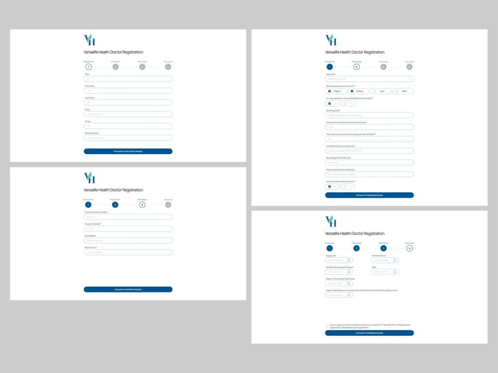
4. Streamlined Doctor Onboarding
Recognizing that doctors are busy, I broke the registration process into 4 digestible steps: Personal Info, Professional, Bank Details, and Documents.
Progress Indicators: A stepped progress bar (1-2-3-4) lets doctors know exactly where they are in the process, reducing drop-off rates.
Clear Uploads: The document verification stage uses large drag-and-drop zones for licenses and IDs, making compliance checks easier.
The Solution
My design strategy focused on “Calm Efficiency.” I used a clean, minimalist aesthetic to reduce cognitive load, ensuring that whether a user is a tech-savvy youth or an elderly patient, the path to care is clear.
1. The Patient Dashboard: Personal & Proactive
I moved away from sterile medical tables to a card-based, welcoming interface.
Warm Welcome: The dashboard greets the user personally (“Good Morning Username!”) and immediately surfaces the most urgent info: upcoming appointments.
Smart Search: The “Find A Doctor” section uses visual cards with doctor photos and clear specializations (e.g., Cardiac Specialist), making the choice feel more human and less transactional.
2. Frictionless Appointment Booking
Booking a doctor shouldn’t require a phone call. I designed a linear, step-by-step flow to guide the user.
Visual Calendar: Users select dates using a clear, familiar calendar UI, followed by “pills” for available time slots (e.g., 04:00 PM – 04:15 PM) to eliminate guessing.
Instant Confirmation: The flow ends with a reassuring “Appointment Successfully Scheduled!” success state, giving users immediate peace of mind.
3. Integrated Telemedicine
To support remote care, I designed a native video consultation interface.
Distraction-Free Calls: The video UI prioritizes the doctor’s video feed while keeping essential controls (mute, camera, chat) accessible but unobtrusive at the bottom.
Side-by-Side Chat: A chat panel allows for text communication during the call without obscuring the video, perfect for sharing text-based instructions or links.
4. Streamlined Doctor Onboarding
Recognizing that doctors are busy, I broke the registration process into 4 digestible steps: Personal Info, Professional, Bank Details, and Documents.
Progress Indicators: A stepped progress bar (1-2-3-4) lets doctors know exactly where they are in the process, reducing drop-off rates.
Clear Uploads: The document verification stage uses large drag-and-drop zones for licenses and IDs, making compliance checks easier.
Design System & Usability
Visual Language
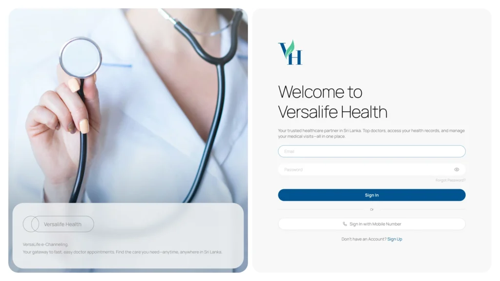
Trustworthy Palette: I utilized a deep teal and medical blue as the primary brand colors to evoke feelings of trust, hygiene, and professionalism.
Clean Typography: Using a modern sans-serif font ensures high readability, which is critical when users are reading dosage instructions or medical advice.
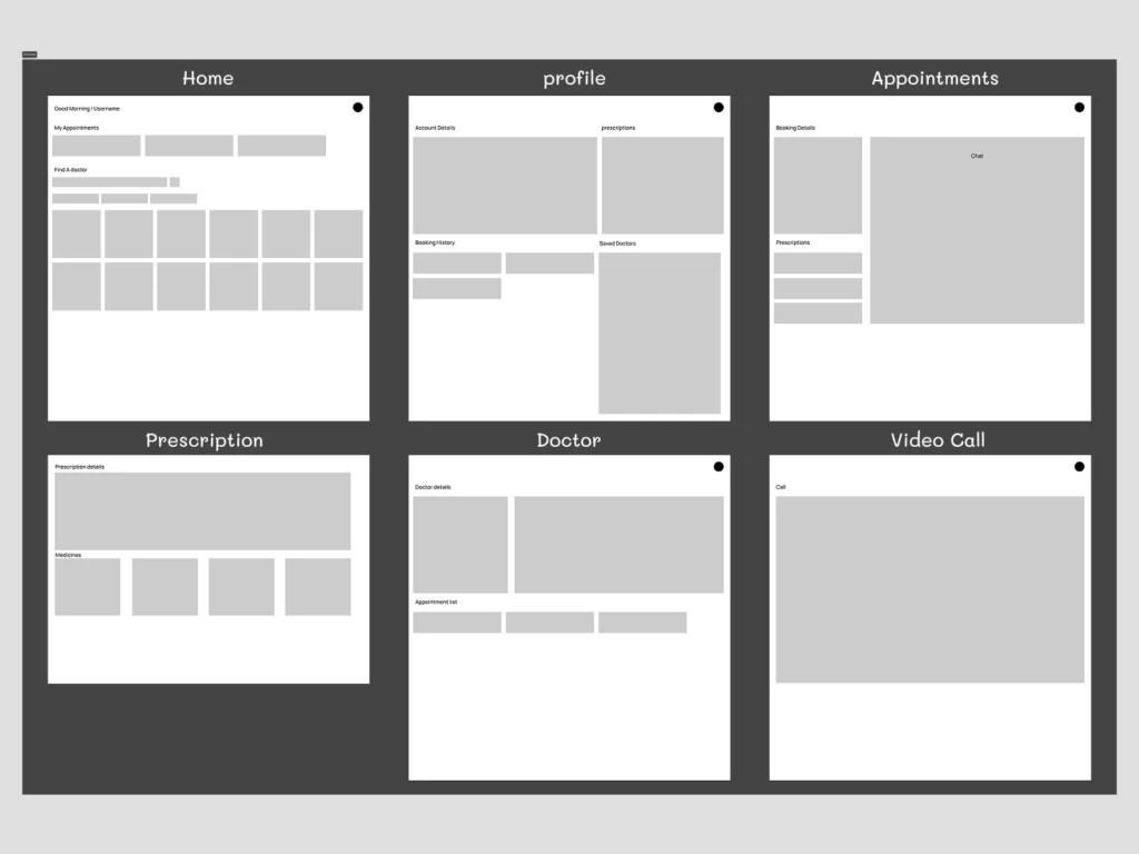
Wireframe to High-Fidelity
Starting with low-fidelity wireframes allowed me to map out the complex information architecture—ensuring that “Prescriptions,” “History,” and “Chat” all had logical homes before applying the final visual polish.
Where do we go from here?
Next Steps
e-Prescriptions: Implementing a feature for doctors to digitally sign and send prescriptions directly to partner pharmacies.
AI Symptom Checker: A pre-triage chatbot to help guide patients to the right specialist category before they book.
What I Learned
Designing Versalife Health reinforced the importance of empathy in UI. When users are dealing with their health, clarity isn’t just a design choice—it’s a requirement. The interface must reassure the user at every step that they are in good hands.
Design System & Usability
Visual Language
Trustworthy Palette: I utilized a deep teal and medical blue as the primary brand colors to evoke feelings of trust, hygiene, and professionalism.
Clean Typography: Using a modern sans-serif font ensures high readability, which is critical when users are reading dosage instructions or medical advice.
Wireframe to High-Fidelity
Starting with low-fidelity wireframes allowed me to map out the complex information architecture—ensuring that “Prescriptions,” “History,” and “Chat” all had logical homes before applying the final visual polish.
Where do we go from here?
Next Steps
e-Prescriptions: Implementing a feature for doctors to digitally sign and send prescriptions directly to partner pharmacies.
AI Symptom Checker: A pre-triage chatbot to help guide patients to the right specialist category before they book.
What I Learned
Designing Versalife Health reinforced the importance of empathy in UI. When users are dealing with their health, clarity isn’t just a design choice—it’s a requirement. The interface must reassure the user at every step that they are in good hands.