
PredicTea: AI-Driven Tea Price Prediction System
Empowering tea factory owners with real-time market insights and data-driven decision making.
Role: Lead UI/UX Designer
Industry: Agriculture Tech / FinTech
Tools: Figma, Adobe Illustrator
Platform: Web Dashboard
PredicTea: AI-Driven Tea Price Prediction System
Empowering tea factory owners with real-time market insights and data-driven decision making.
Role: Lead UI/UX Designer
Industry: Agriculture Tech / FinTech
Tools: Figma, Adobe Illustrator
Platform: Web Dashboard
The Product
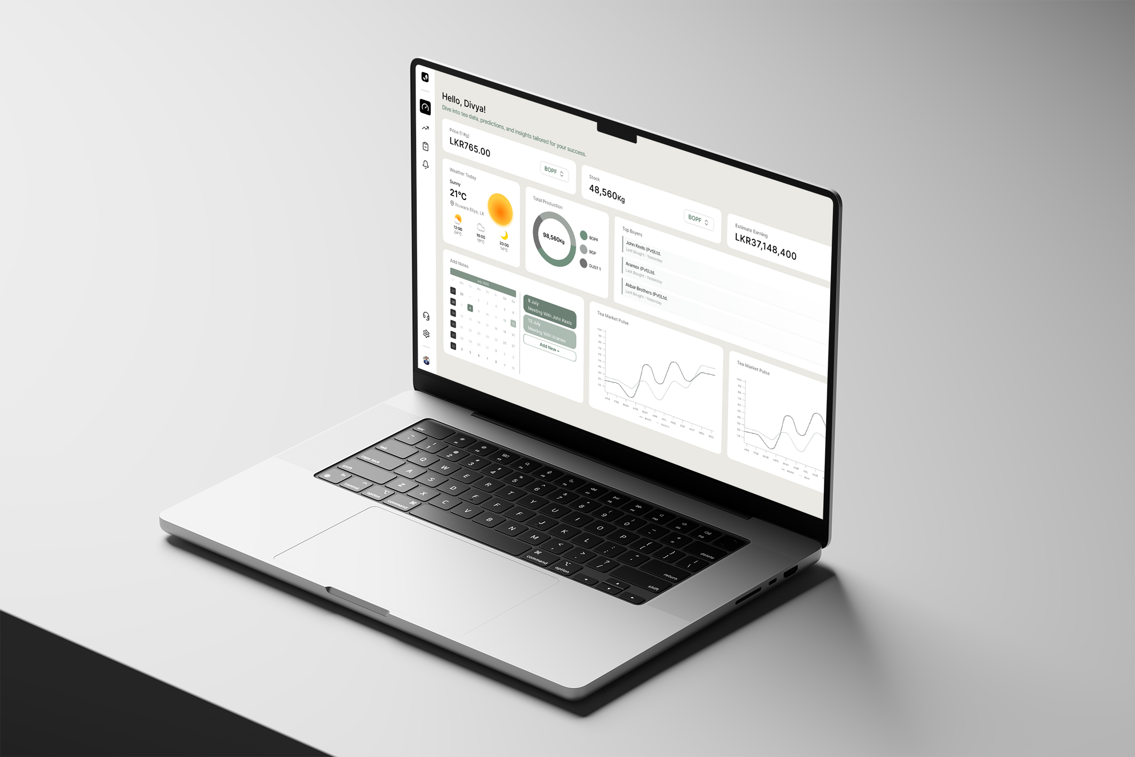
PredicTea is a comprehensive dashboard for tea factory managers and stakeholders in Sri Lanka. It leverages machine learning to predict tea auction prices, track stock levels, and provide actionable insights into market trends. It serves as a central hub for monitoring production, earnings, and buyer activity.
The Product
PredicTea is a comprehensive dashboard for tea factory managers and stakeholders in Sri Lanka. It leverages machine learning to predict tea auction prices, track stock levels, and provide actionable insights into market trends. It serves as a central hub for monitoring production, earnings, and buyer activity.
Users
Tea factory owners, estate managers, and brokers who deal with volatile market prices and need to make quick, informed decisions about when to sell their stock (BOPF, BOP, DUST1) to maximize profit.
Users
Tea factory owners, estate managers, and brokers who deal with volatile market prices and need to make quick, informed decisions about when to sell their stock (BOPF, BOP, DUST1) to maximize profit.
The Business Goal
To demystify complex tea market data. The goal was to move users away from gut-feeling decisions or scattered spreadsheets into a unified, predictive interface that increases their profit margins and operational efficiency.
The Business Goal
To demystify complex tea market data. The goal was to move users away from gut-feeling decisions or scattered spreadsheets into a unified, predictive interface that increases their profit margins and operational efficiency.
The Challenge
How might we translate complex volatility into clarity?
Tea prices fluctuate daily based on global demand, weather in regions like Nuwara Eliya, and buyer behavior.
Data Overload: Users were previously overwhelmed by raw numbers and disconnected data sources (weather apps vs. market sheets).
Lack of Foresight: Without prediction models, users were reactive rather than proactive, often losing potential earnings on “bad” market days.
The Solution
My approach was to design a “Command Center” that places the most critical decision-making data at the top level, while keeping granular reports accessible but secondary.
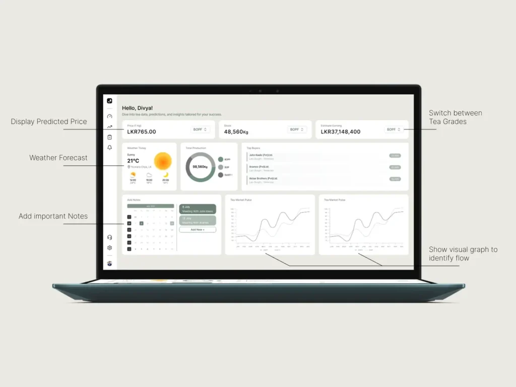
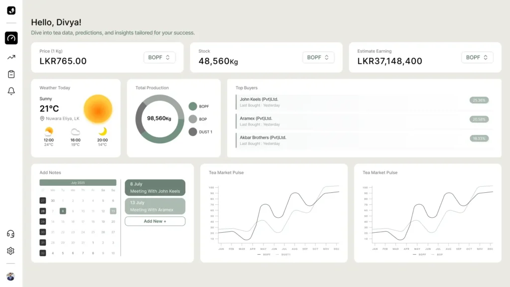
1. The Dashboard: clarity at a glance
I designed the dashboard to answer the user’s three most urgent questions immediately: What is the price today? How much stock do I have? What will I earn?
Key Metrics Cards: Placed high-priority data (Price, Stock, Earnings) at the top with clear trend indicators.
Contextual Weather: Integrated local weather forecasts (e.g., Nuwara Eliya) directly alongside production data, as humidity and temperature directly impact tea leaf quality and harvest volume.
Visualizing the “Pulse”: utilized smooth line graphs to show the “Tea Market Pulse,” allowing users to spot trends (peaks and troughs) in grades like BOPF and Dust 1 without needing to read raw tables.
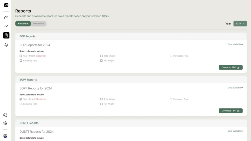
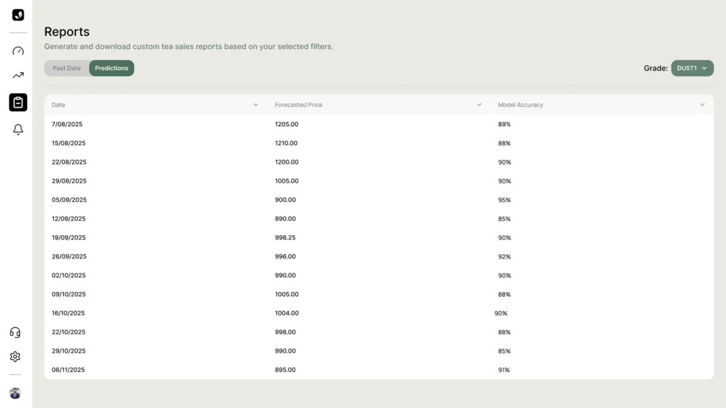
2. Reports & Predictions: Trust through Transparency
AI predictions can be hard to trust. To build user confidence, I designed the Reports section to be transparent about accuracy.
Accuracy Metrics: Explicitly displaying “Model Accuracy” (e.g., 89%, 95%) allows users to gauge risk.
Customizable Views: Users can filter by Grade (DUST1, BOP) or Date Range to generate bespoke PDF reports for board meetings or bank submissions.
Past vs. Future: A toggle switch allows users to easily compare Historical Data against Future Predictions to validate the system’s performance.
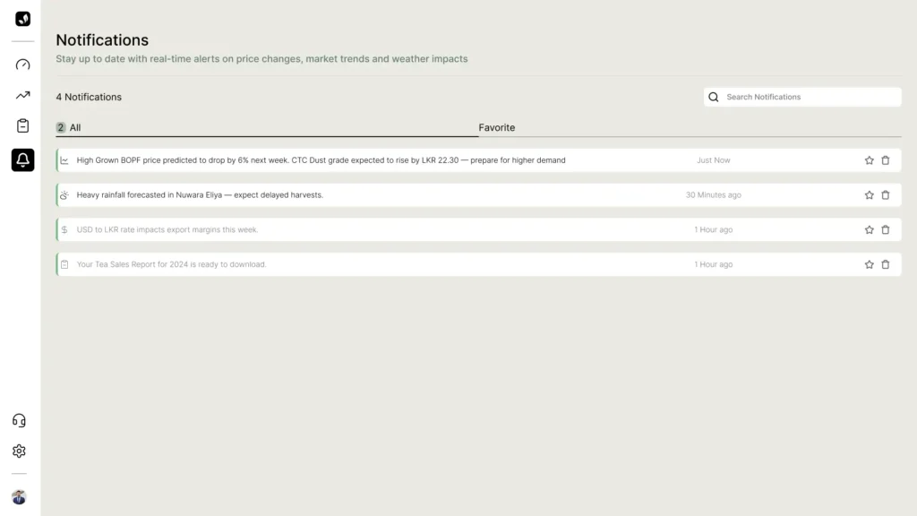
3. Actionable Notifications
Passive data isn’t enough; users need to know when to act. The Notification Center was designed to be a proactive assistant.
Smart Alerts: Instead of generic updates, the system sends actionable insights, such as “High Grown BOPF price predicted to drop by 6% next week… prepare for higher demand.”
Priority Sorting: Alerts are categorized by type (Price, Weather, System) so urgent market shifts aren’t missed.
The Solution
My approach was to design a “Command Center” that places the most critical decision-making data at the top level, while keeping granular reports accessible but secondary.
1. The Dashboard: clarity at a glance
I designed the dashboard to answer the user’s three most urgent questions immediately: What is the price today? How much stock do I have? What will I earn?
Key Metrics Cards: Placed high-priority data (Price, Stock, Earnings) at the top with clear trend indicators.
Contextual Weather: Integrated local weather forecasts (e.g., Nuwara Eliya) directly alongside production data, as humidity and temperature directly impact tea leaf quality and harvest volume.
Visualizing the “Pulse”: utilized smooth line graphs to show the “Tea Market Pulse,” allowing users to spot trends (peaks and troughs) in grades like BOPF and Dust 1 without needing to read raw tables.
2. Reports & Predictions: Trust through Transparency
AI predictions can be hard to trust. To build user confidence, I designed the Reports section to be transparent about accuracy.
Accuracy Metrics: Explicitly displaying “Model Accuracy” (e.g., 89%, 95%) allows users to gauge risk.
Customizable Views: Users can filter by Grade (DUST1, BOP) or Date Range to generate bespoke PDF reports for board meetings or bank submissions.
Past vs. Future: A toggle switch allows users to easily compare Historical Data against Future Predictions to validate the system’s performance.
3. Actionable Notifications
Passive data isn’t enough; users need to know when to act. The Notification Center was designed to be a proactive assistant.
Smart Alerts: Instead of generic updates, the system sends actionable insights, such as “High Grown BOPF price predicted to drop by 6% next week… prepare for higher demand.”
Priority Sorting: Alerts are categorized by type (Price, Weather, System) so urgent market shifts aren’t missed.
Design System & Usability
Visual Language
Color Palette: I utilized an “Earth & Tech” palette—using organic greens (referencing fresh tea leaves) for primary actions and branding, balanced against a clean, off-white/beige background to reduce eye strain during long working hours.
Typography: Clean, sans-serif typography ensures legibility of dense numerical data (prices, weights, dates).
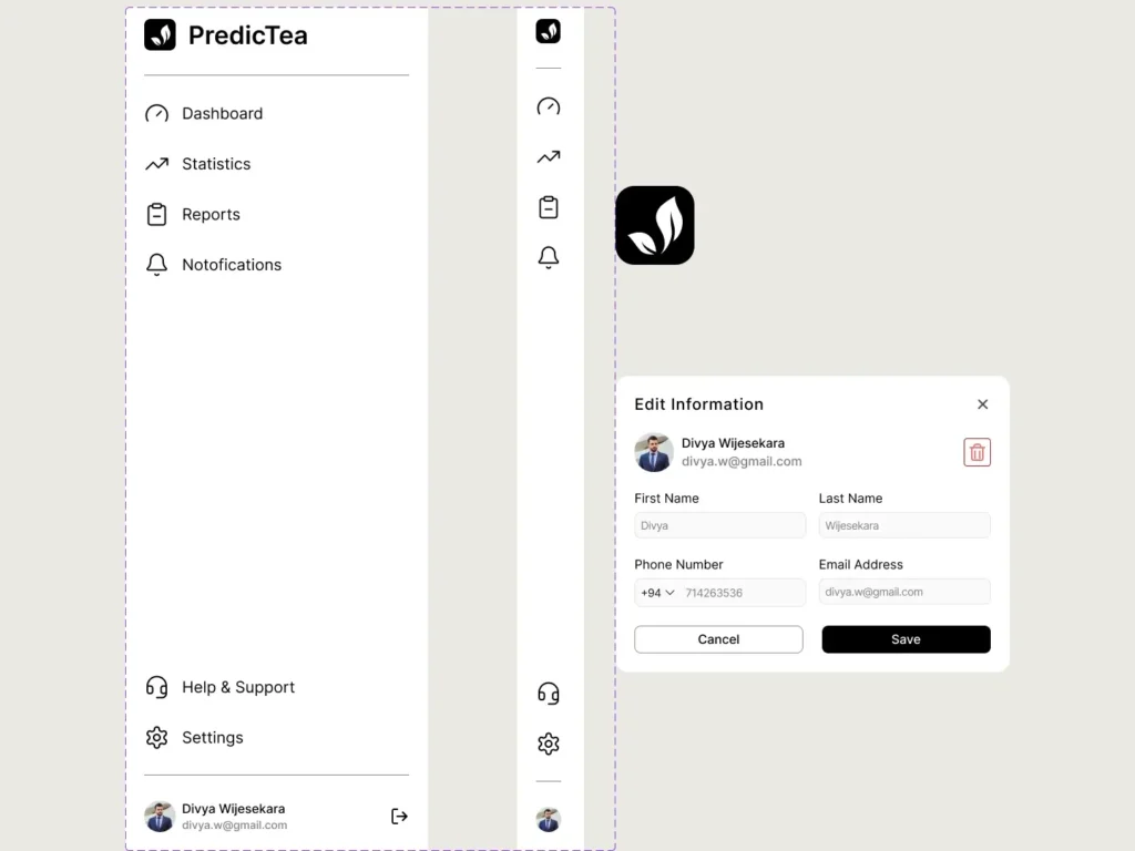
Navigation Structure
I adopted a sidebar navigation to maximize horizontal screen real estate for the complex charts and data tables.
Icons: Custom iconography (leaf for branding, gauge for dashboard, graph for statistics) provides quick visual cues for navigation.
Where do we go from here?
Next Steps
Mobile Adaptation: Tea managers are often in the field. A mobile companion app for quick alerts would be the next logical phase.
Buyer Integration: Connecting the “Top Buyers” module directly to a communication channel to facilitate immediate offers.
Design System & Usability
Visual Language
Color Palette: I utilized an “Earth & Tech” palette—using organic greens (referencing fresh tea leaves) for primary actions and branding, balanced against a clean, off-white/beige background to reduce eye strain during long working hours.
Typography: Clean, sans-serif typography ensures legibility of dense numerical data (prices, weights, dates).
Navigation Structure
I adopted a sidebar navigation to maximize horizontal screen real estate for the complex charts and data tables.
Icons: Custom iconography (leaf for branding, gauge for dashboard, graph for statistics) provides quick visual cues for navigation.
Where do we go from here?
Next Steps
Mobile Adaptation: Tea managers are often in the field. A mobile companion app for quick alerts would be the next logical phase.
Buyer Integration: Connecting the “Top Buyers” module directly to a communication channel to facilitate immediate offers.